Product Designer · SubSavvy · iOS
Keeping subscriptions visible, without moving data to the cloud.
SubSavvy
ROLE
Solo Product Designer
DURATION
April 2025 -
Julay 2025
TEAM
Product Designer · Engineer
METHODS
Overview
I redesigned SubSavvy, a private, offline-first iOS subscription manager, to make recurring payments easier to track and everyday actions clearer.
CONTEXT
The project focused on redesigning the existing SubSavvy experience around clearer subscription tracking and simpler management. Working with an engineer, I revisited the core flows and interface across light and dark modes, with local data storage and account-free use as key requirements.
MY CONTRIBUTION
As the solo product designer, I reworked the core flows, visual hierarchy, and reusable components. I tested interactive prototypes, refined action labels and control placement, and prepared the redesigned screens and interaction details for development.
IMPACT
Clearer actions
Refined labels and control placement following prototype feedback.
Consistent themes
Reusable components and a shared visual hierarchy across light and dark modes.
Ready for development
Core screens, flows, and interaction details prepared for handoff.
The problem
Subscriptions are easy to start and surprisingly hard to keep track of.
Recurring payments sit across different services and renewal dates. The redesign focused on making those commitments easier to understand and manage within SubSavvy, with privacy and account-free use as core requirements.
Reviewing the original experience
How clearly did the original experience help people track spending, add subscriptions, and manage them?
I reviewed the original screens to identify gaps in spending visibility, form hierarchy, and subscription management.
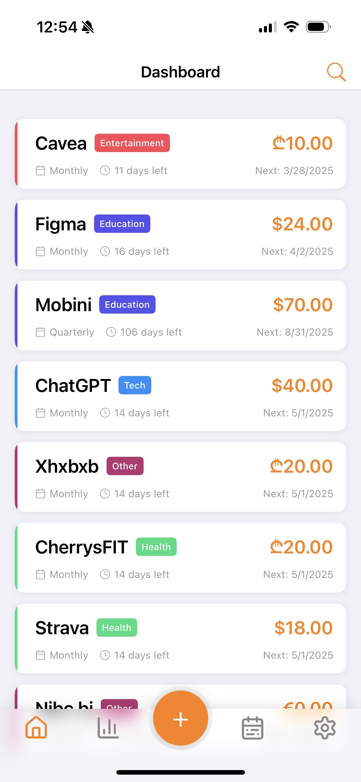
OBSERVATION 01
Spending context missing
The dashboard showed individual subscriptions without a monthly spending summary. Spending totals were available separately in Analytics.
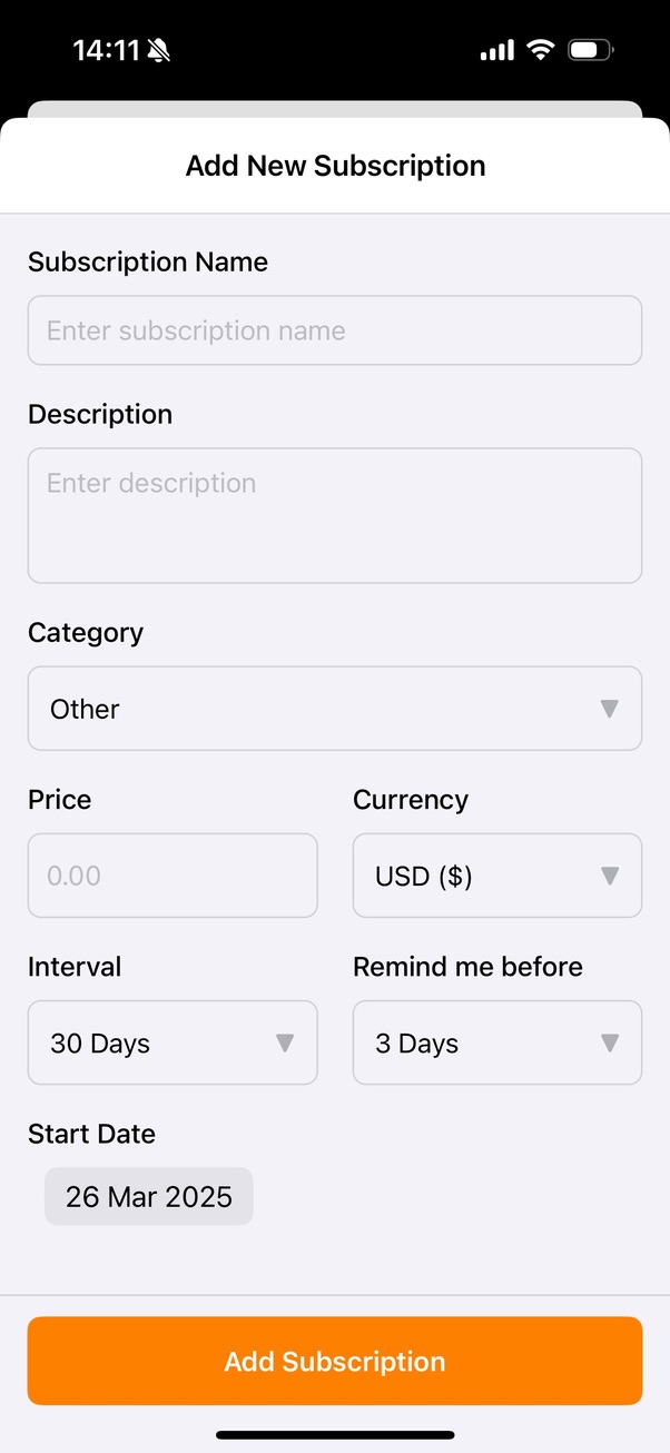
OBSERVATION 02
Unclear field hierarchy
The add-subscription form presented essential details and secondary settings together, with limited grouping or visual hierarchy to guide users through what to enter first.
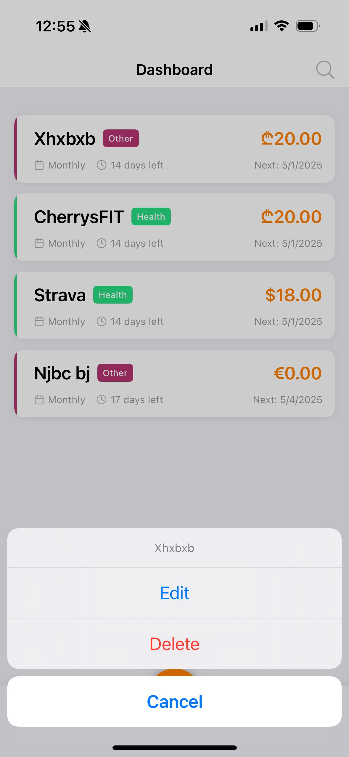
OBSERVATION 03
Limited management controls
The shown action sheet offered Edit and Delete for one subscription. No multi-selection or bulk-management controls were visible in the supplied original screens.
Design
01 / 03
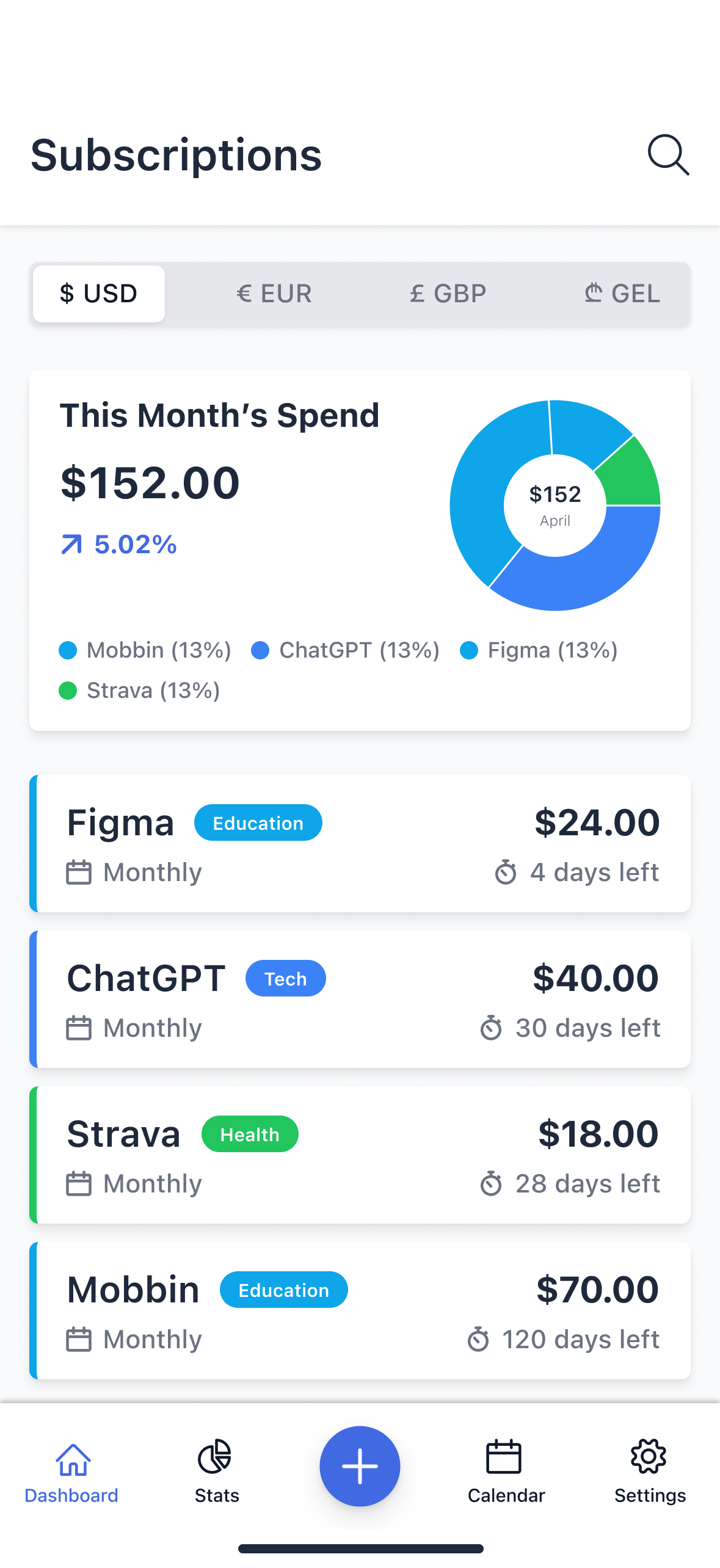
Making cost visible
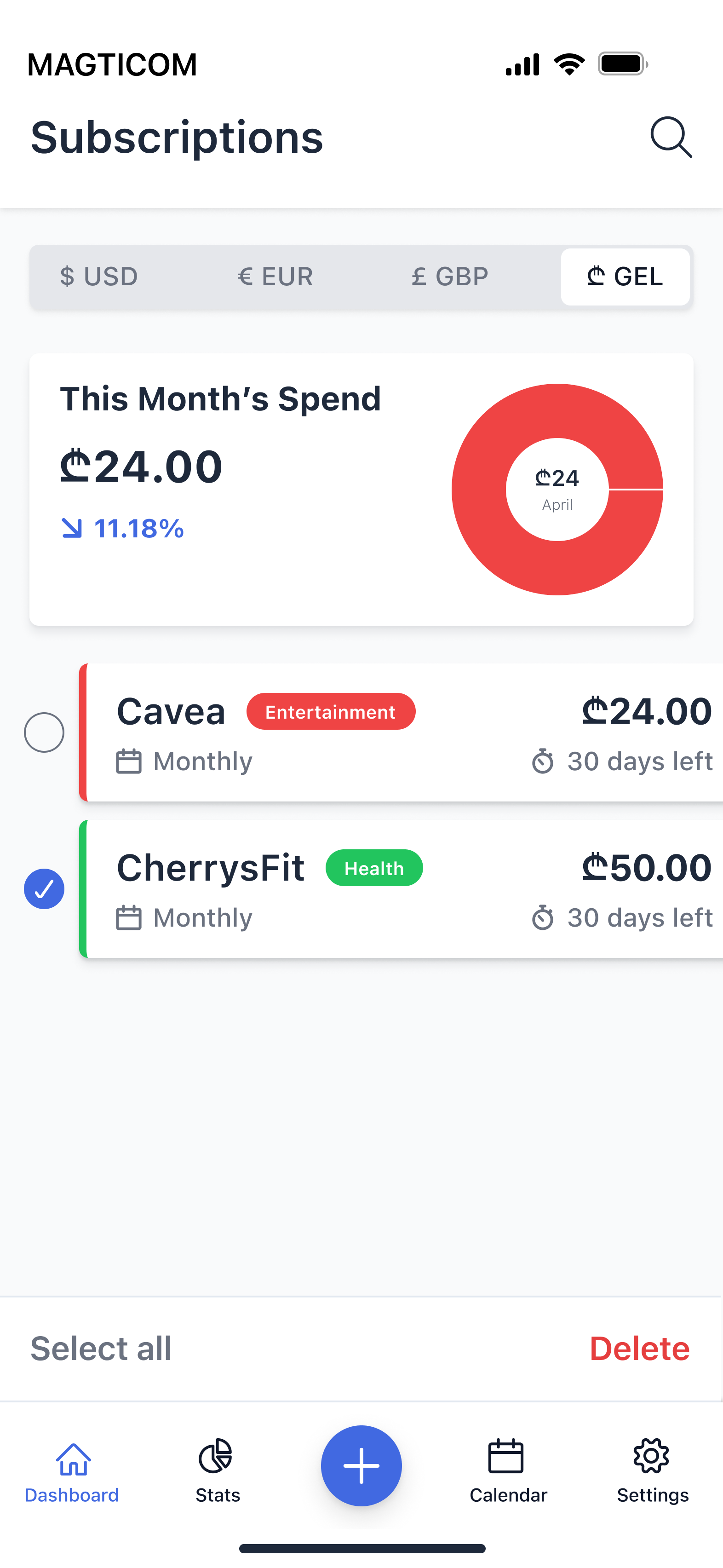
I brought “This Month’s Spend” and a category breakdown onto the Subscriptions screen, placing a spending summary above the list. Currency controls sit near the top, while each subscription keeps its price, billing cycle, and days remaining visible.
Previous

Re-designed
02 / 03
Making it lightweight
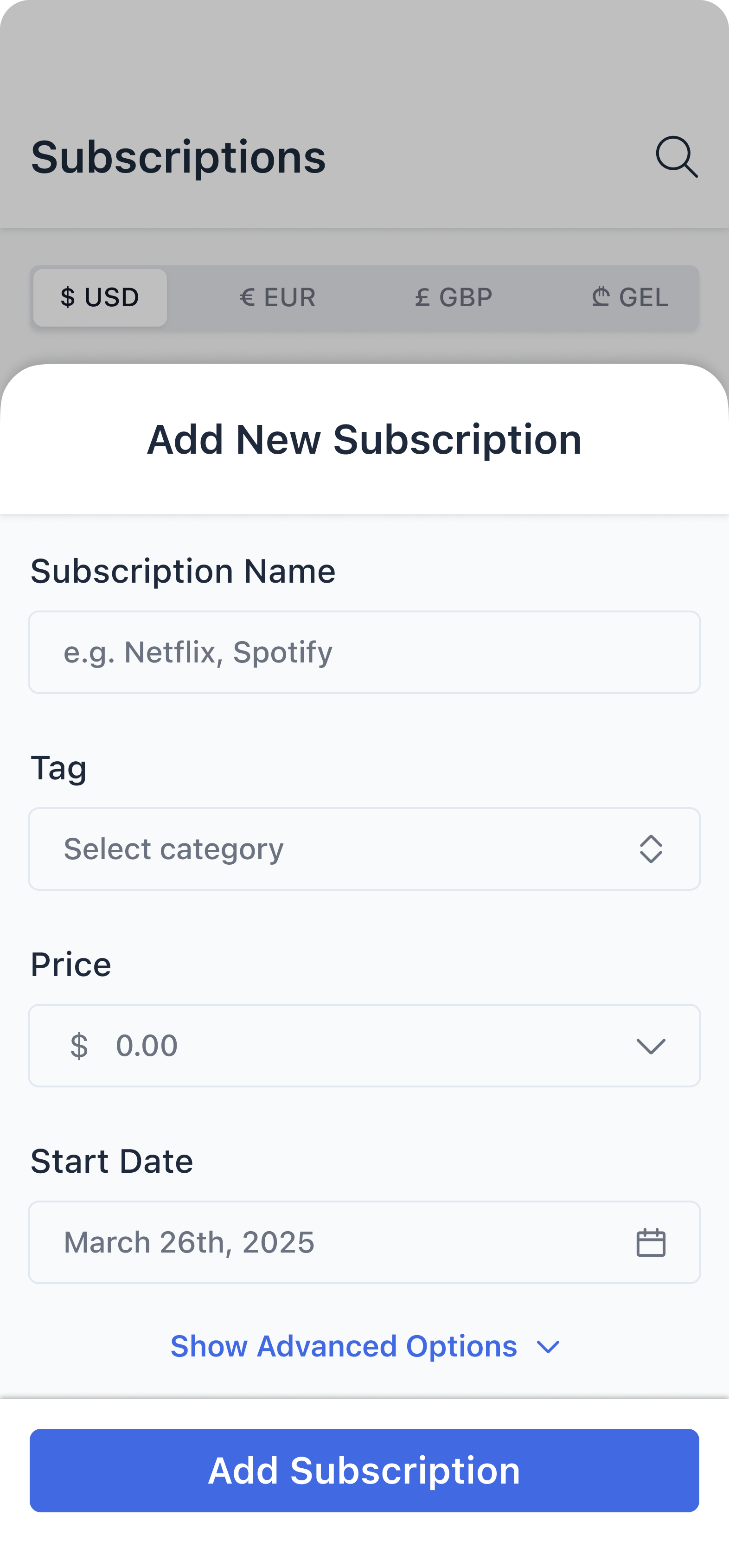
I separated the initial entry form from its advanced options. Name, tag, price, and start date appear first; billing cycle, reminders, and notes sit in an expandable area. This keeps the first view focused while retaining the additional controls.
Previous
Re-designed
03/ 03
Making actions explicit
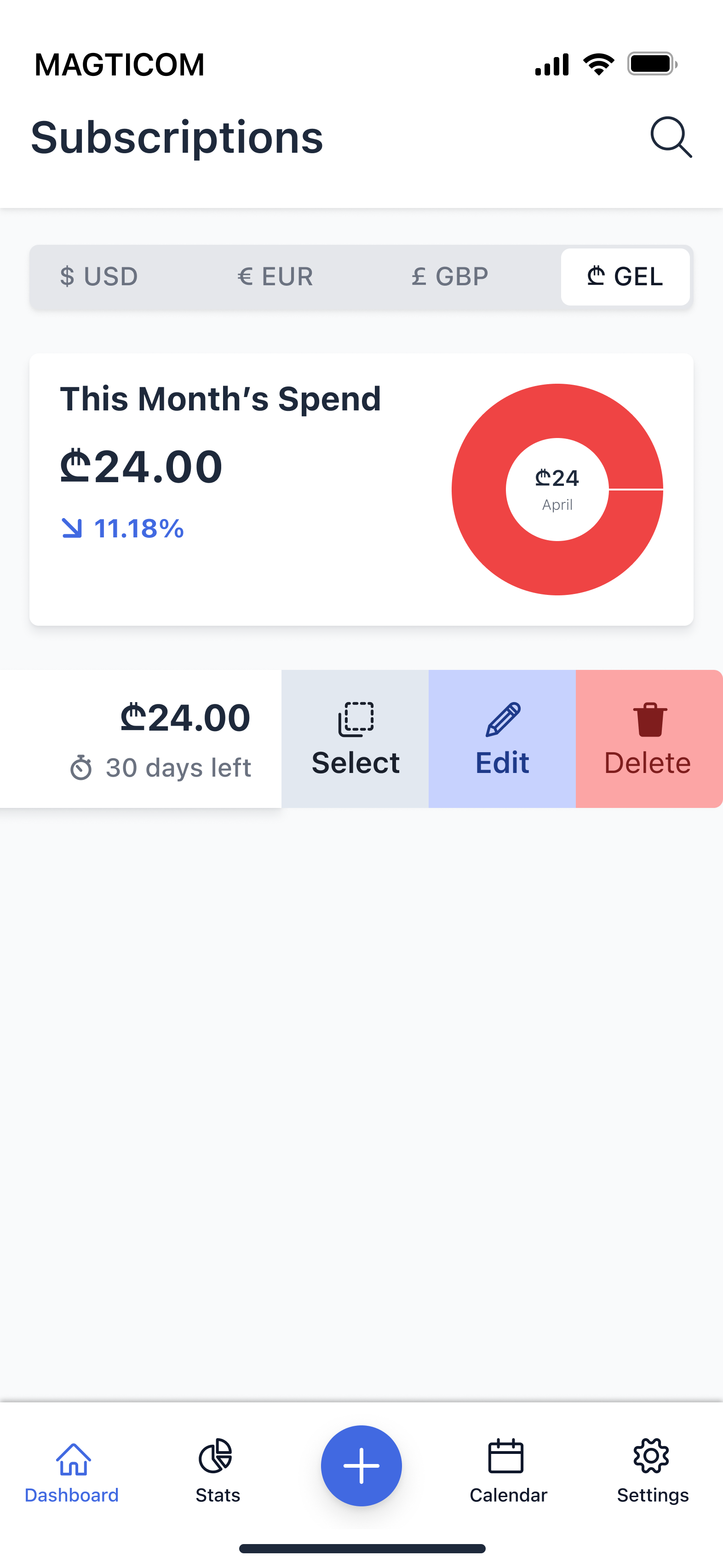
I replaced the shown Edit/Delete action sheet with labeled row actions and a selection state. Select, Edit, and Delete appear beside the item, while checkboxes and Select all support managing multiple subscriptions from one view.
Previous
Re-designed
Outcome
A focused product built around visibility, control, and privacy.
At-a-glance tracking
Upcoming payments and recurring costs brought into one clear overview.
Simple management
Focused flows for adding subscriptions, updating details, and setting reminders.
Offline by design
An account-free experience with subscription data stored on the device.
The redesign brought the core iOS flows, visual system, and interactive prototypes into one consistent experience, with screens and interaction details prepared for development.