INDEPENDENT REDESIGN PROPOSAL · TBILISI PARKING
Making everyday parking clearer in Tbilisi
Tbilisi parking app
ROLE
Solo Product Designer
DURATION
February 2025 -
April 2025
TEAM
Product Designer
METHODS
Overview
Tbilisi Parking is an independent redesign proposal that makes everyday parking tasks clearer from choosing a vehicle and zone to monitoring and ending a session.
CONTEXT
I reviewed the existing Tbilisi Parking app and developed a focused redesign proposal over one month, exploring clearer service information and more visible session controls.
MY CONTRIBUTION
As the UX/UI designer, I led the interface audit, reworked the core flows, and designed the proposed screens and interactive prototype, including light and dark appearances.
EXISTING PROBLEMS
Unclear task hierarchy
The original setup presented vehicle, zone, and lot information without a strong visual sequence. The relationship between these choices needed to be clearer before starting a session.
Scattered key information
Balance and vehicle details competed for attention on the main screen. The redesign needed to make it easier to scan available funds and identify the vehicle to park.
Limited session visibility
Active parking needed a more prominent place in the experience. Session details and the action to end parking should remain easy to find when drivers return to the app.
MY DESIGN RESPONSE
Guided parking setup
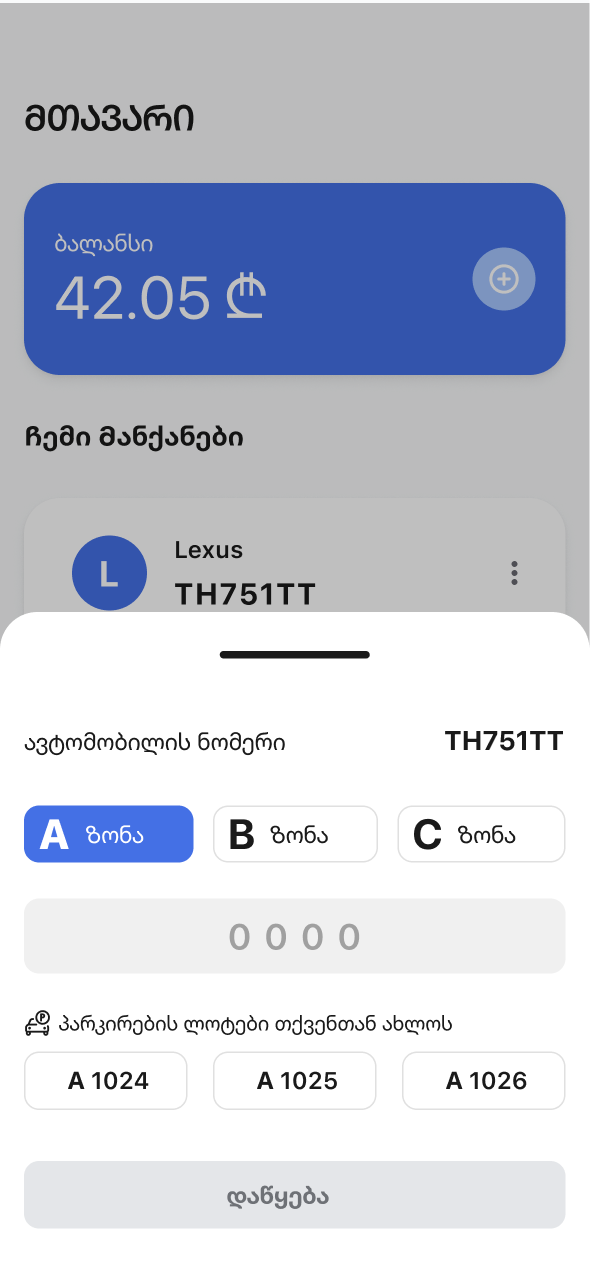
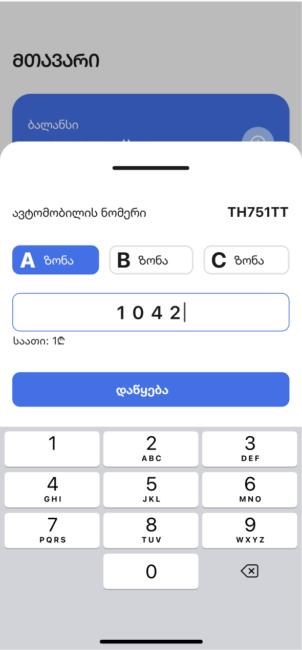
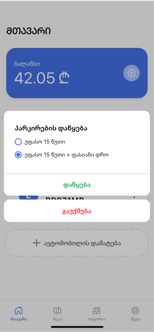
I grouped the selected vehicle, zone choice, and lot entry in a focused bottom sheet. Keeping these decisions together gives the setup a clear order before the driver confirms parking.
Clearer home hierarchy
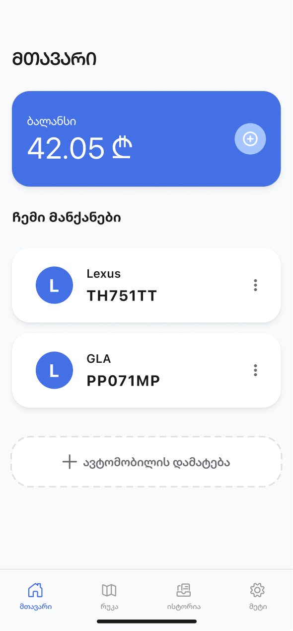
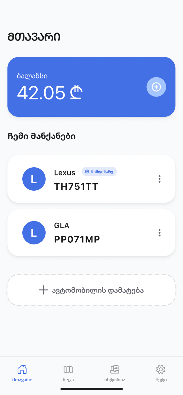
I placed the account balance at the top and organized saved vehicles into distinct cards. This gives the home screen a clearer hierarchy and makes the next parking action easier to locate.
Visible session status
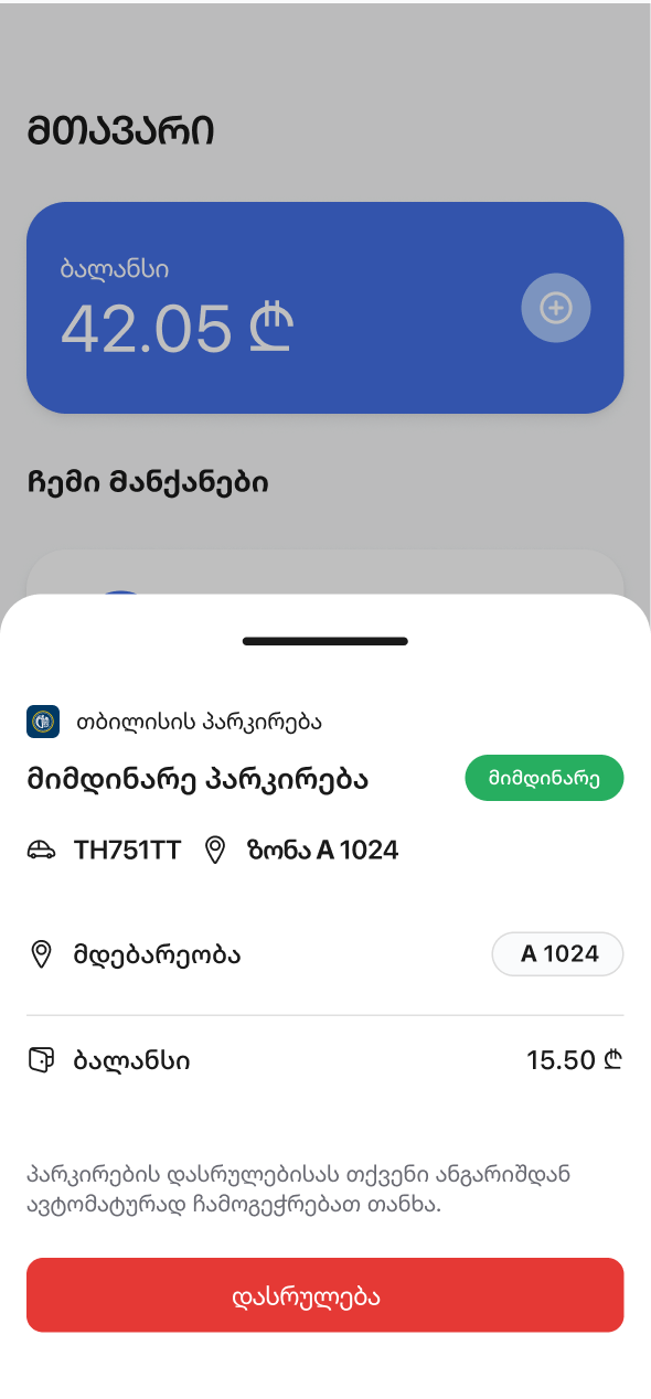
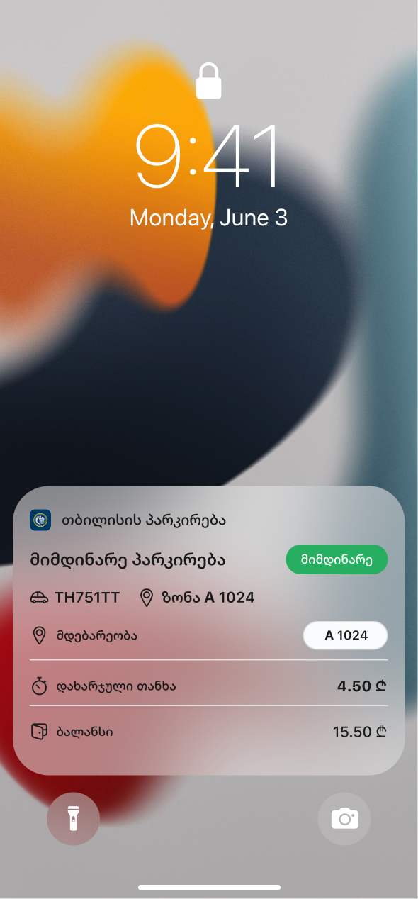
I brought active-session details and the end-parking action into a dedicated view. I also explored lock-screen updates so drivers could check parking status without reopening the app.
Research
Where do drivers hesitate when starting, checking, and ending parking?
The interface audit suggests several areas to explore with drivers. This proposed study would examine real parking situations, clarify the moments of uncertainty, and help prioritize the redesign before implementation.
PROPOSED STUDY · 10–15 DRIVERS · INTERVIEWS + TASK WALKTHROUGHS
01 · UNDERSTAND THE CONTEXT
How does parking fit into the day?
Speak with frequent and occasional users about their most recent parking experience.
SAMPLE PROMPTS
Walk me through the last time you parked.
When do you open the app?
What information do you check first?
02 · EXPLORE THE FRICTION
Where does uncertainty appear?
Explore vehicle and zone selection, confirmation, balance, and ending a session.
SAMPLE PROMPTS
Which step made you hesitate?
How did you know parking had started?
How did you remember to end it?
03 · VALIDATE THE DIRECTION
Do the proposed flows help?
Ask drivers to complete core tasks in the prototype and explain what they expect.
SAMPLE PROMPTS
Start parking for a saved vehicle.
Check the current parking status.
Find the action to end the session.
HYPOTHESES TO VALIDATE
HYPOTHESIS 1
Confirmation builds confidence
A persistent status indicator may help drivers confirm the correct vehicle and zone are active.
HYPOTHESIS 2
A clear sequence reduces hesitation
Grouping vehicle, zone, and lot entry may make session setup easier to follow.
HYPOTHESIS 3
Visible controls support follow-through
Accessible session details and an explicit end action may help drivers manage parking with less uncertainty.
Design
01 / 04
Bring the essentials onto the home screen
Balance and saved vehicles have a clear hierarchy. An active-parking badge connects the session to the correct vehicle, while adding a vehicle remains a distinct action.
02 / 04
Guide drivers through starting a season
A focused bottom sheet brings the selected vehicle, zone choice, and lot entry together. Nearby lot suggestions offer another way to choose a location, followed by a clear confirmation.
03 / 04
Keep active parking within reach
Session details and the end-parking action sit in a dedicated view. Lock-screen updates explore how drivers could stay aware of an active session outside the app.
04 / 04
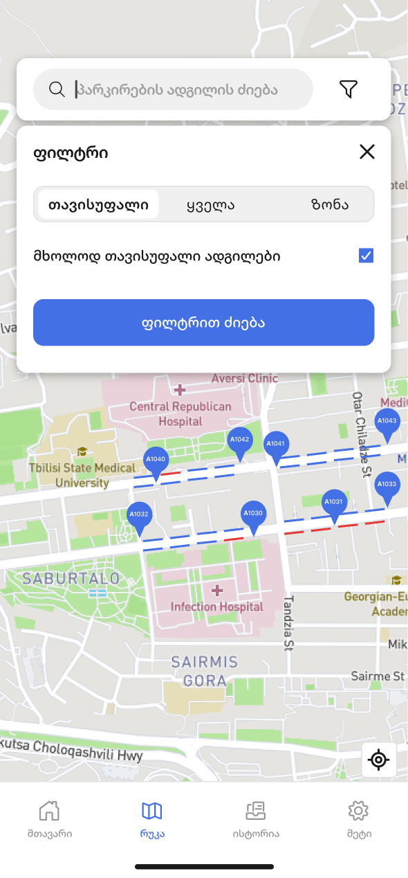
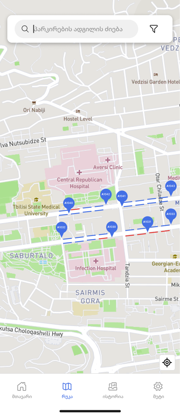
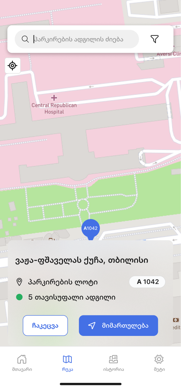
Make the map useful at the point of decision
Search, filters, and a focused lot detail view connect browsing to understanding a location. Availability shown in the concept would require a reliable data source before implementation.
WHAT I LEARNED
For a parking app, visual polish is only part of the work. The interface needs to make the current state clear: which vehicle is selected, where it is parked, and whether the session is running. Designing around those decisions gave the proposal a more focused direction.
WHAT I’D DO DIFFERENTLY
I’d involve drivers earlier and observe the app in real parking situations. I’d also review service constraints before developing notification and availability concepts, so the proposed experience is grounded in both user needs and what the service can support.
TAKEAWAY
This redesign is a starting point for a clearer everyday parking experience in Tbilisi. My next step would be to test the core flows, refine the moments of uncertainty, and work with the responsible team to turn the proposal into a practical direction for development.